How to Design Lead Magnets in Canva Step-by-Step
Plan content, apply simple branding, and export mobile-ready lead magnet PDFs with one CTA using Canva and PDF Standard.
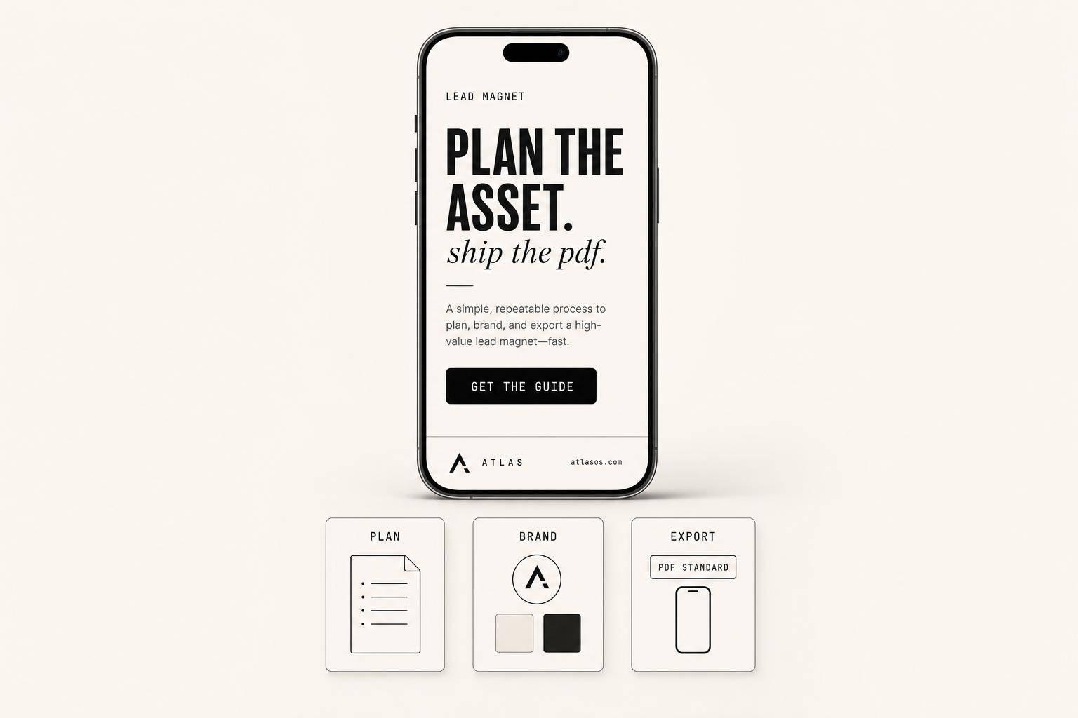
How to Design Lead Magnets in Canva Step-by-Step
You can build a clean lead magnet in Canva in one sitting if you keep it simple. The core process is: pick one format, outline the content first, use a plain US Letter template, keep branding tight, add one CTA, then export as PDF Standard and test it on desktop and phone.
Here’s the whole article in plain English:
- I start by choosing the right format for the goal:
- Checklist for a fast win
- Cheat sheet for fast reference
- Resource list for tools or links
- Short guide for teaching one process
- Workbook for more hands-on use
- I plan the PDF before designing:
- define the problem
- define who it helps
- define the result
- outline each page
- I set up Canva with the right file size:
- US Letter: 8.5 x 11 inches
- search terms like ebook, guide, checklist, or workbook
- I keep the design simple:
- 2 to 3 colors
- 2 fonts max
- one main idea per page
- single-column layouts for easier phone reading
- I finish with conversion in mind:
- clear cover
- readable spacing
- footer URL or logo
- one last-page CTA
- I export the file the right way:
- use PDF Standard
- test every link
- check page order
- review on mobile
A few numbers matter here: most short guide lead magnets work best at 3 to 7 pages, while workbooks often run 5 to 15 pages. And if you are new to this, a 1-page checklist or cheat sheet is often the best place to start.
If I had to sum up the article in one line, it would be this: do the thinking before Canva, then keep the design clean and easy to act on.
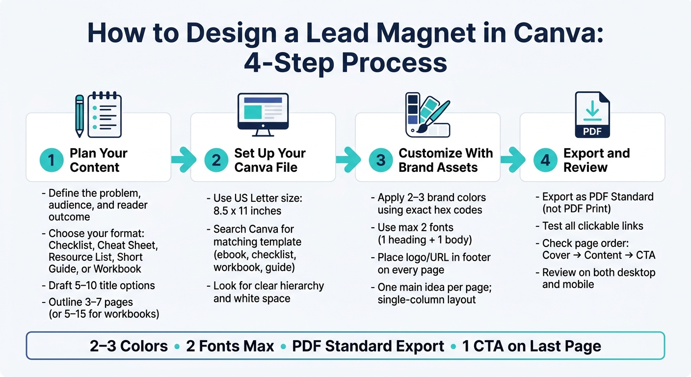
How to Design a Lead Magnet in Canva: 4-Step Process
Canva Lead Magnet Tutorial | Build Your First Canva Lead Magnet Today
sbb-itb-e9b8513
Step 1: Plan Your Content and Set Up Your Canva File
Before you open Canva, build a working outline in Google Docs. That simple move gives you a clear path instead of a blank page staring back at you. Nail down the core promise, who this is for, and what result the reader should get. Then Canva becomes the design step, not the thinking step.
Outline Your Offer, Main Sections, and Reader Outcome
Start with the basics:
- The one problem your lead magnet solves
- Who it’s for
- What the reader will be able to do after reading it
Write those points down in plain English. If you can’t state them clearly, the lead magnet itself will probably feel fuzzy too.
Next, map out the sections. If you’re making a mini-guide or how-to PDF, aim for 3 to 7 pages. Keep it tight. One page should carry one main idea. If you have extra details, push them to the next page or save them for a bonus section.
A simple structure usually works best:
- A short intro
- The main steps or key points
- A last page with one clear next step, like booking a call or visiting a service page
That’s enough to guide the reader without dragging things out.
Then draft 5–10 title options. Don’t settle on the first one. Pick the title and subtitle that most clearly show the result the reader wants.
Once your outline is done, choose a file size and template that fit that page plan.
Create a New Canva Design With the Right Size and Template
If your audience is in the United States, start with US Letter size: 8.5 x 11 in. In Canva, search for "US Letter document" or "Flyer (Portrait 8.5 x 11 in)" to pull up the right dimensions.
Use US Letter for standard PDFs. Switch to a landscape presentation layout only if your content needs more horizontal space.
After that, search Canva for a template that matches your format. Here’s a simple guide:
| Lead Magnet Format | Recommended Canva Search Terms |
|---|---|
| Checklist | "checklist", "planner" |
| Mini-Guide / eBook | "ebook", "guide", "report" |
| Workbook | "workbook", "planner" |
| Resource List | "resource list", "media kit" |
| Quick-Start Guide | "guide", "presentation" |
When you’re picking a template, look for clear hierarchy, plenty of white space, and page styles that match from start to finish. If the thumbnail feels crowded, skip it. That kind of layout usually gets messy fast once you add your own copy.
With the template picked, you’re ready to swap in your branding and start replacing the placeholder content.
Step 2: Customize the Template With Brand Assets and Content
With your template open and your outline ready, it’s time to make the design feel like your lead magnet, not just a Canva starter file. This is the point where a plain template starts to look branded and polished.
Apply Brand Colors, Fonts, and Logo Placement
Start with your colors and fonts. This is the fastest way to make the template feel on-brand.
Stick to 2 to 3 brand colors and paste your exact hex codes into Canva’s color picker for a precise match. For fonts, keep it simple: use one for headings and one for body text. Cap it at two total so the design stays clean and steady from page to page.
You can also save your colors, fonts, and logo in Canva’s Brand tab, which makes reuse much easier later. For your logo or website URL, place it in the same spot on every page, usually in the footer. That keeps your brand visible without cramming the layout.
Once that frame is in place, move on to the words and the page structure.
Replace Placeholder Content and Improve Page Layout
Now swap out the placeholder copy for your own content by clicking into each text block. Then use Canva’s drag-and-drop editor to replace sample images with your uploads or Canva stock images.
If a page feels packed, trim it down to one main idea. That one shift can make the whole piece easier to scan.
A few simple layout moves help a lot:
- Break long paragraphs into shorter sections with clear headers
- Use bullet points for steps or short lists
- Add square shapes from the Elements tab behind text to make callout boxes or highlighted titles
Canva’s alignment guides help keep everything lined up on the grid. And if you want to repeat a design element without rebuilding it, hold Alt while dragging to duplicate an aligned element.
For most lead magnets, stick with a single-column layout. It’s easier to read, especially on mobile. Use two columns only when you’re dealing with dense lists or side-by-side comparisons.
After the layout looks clean, the next move is to sharpen readability and add the final conversion cue.
Step 3: Polish the Lead Magnet for Readability and Conversion
Once the layout is done, give the PDF one final pass. The goal is simple: make it easy to read and easy to act on.
Improve the Cover, Section Flow, and On-Page Readability
Start with the cover title. It should speak to one clear problem or one clear result for your target audience, so people can grasp the value right away.
Then read through the full document with fresh eyes. Pretend you're seeing it for the first time. Is the point of each page clear at a glance? If not, the fastest fix is often spacing. Add more padding, use more line spacing, and leave more white space so the page doesn't feel cramped.
A few small design checks go a long way:
- Make headings larger than body text, and make subheadings smaller than headings.
- Avoid low-contrast text, like light gray on white. In most cases, dark text on a light background is the safest choice.
- Check the PDF on a phone, not just a desktop. Fonts and images can shift on smaller screens, and issues that seem invisible on a laptop can jump out on mobile right away.
Add Brand Details and a Clear Next Step
Once readability looks clean, add light branding and one clear action.
A footer URL or social handle on each page helps keep your brand present without stealing attention from the content. Think of it like a quiet signature. It's there if readers want to find you, but it doesn't get in the way.
On the last page, include one CTA, such as booking a discovery call or visiting a specific service page. Keep it tied to what the reader just learned, so the next step feels natural instead of forced.
If your PDF has links, add them in Canva and export the file as PDF Standard so the links stay clickable.
Step 4: Export the PDF and Review the Final File
Export as PDF and Choose the Smallest File That Still Looks Sharp
Once your layout is locked in, it's time to export the file and check it outside Canva.
For digital lead magnets, use PDF Standard. Save PDF Print for physical printing, since it creates a larger file.
PDF Standard keeps the file smaller, easier to send, and it preserves clickable links. Before exporting, do one last pass through every page in Canva. Make sure the order is right: cover first, content in sequence, and the CTA last.
Final Review Checklist and Key Takeaways
After export, review the PDF the way a reader will. Open the downloaded file in a PDF viewer, then check it on your phone too. This step matters more than people think. A PDF can look perfect on your laptop and still feel off on mobile.
Then click every link in the file. That includes CTA buttons, footer URLs, and social media icons. They may look fine on the page but still send people to the wrong place - or nowhere at all.
Here’s a quick check before you publish:
| What to Check | What to Look For |
|---|---|
| Visual consistency | 2 fonts max, consistent colors, readable on mobile |
| Links | Every URL and CTA button opens the correct page |
| Page flow | Cover → content → CTA, in that order |
| Export setting | PDF Standard selected, not PDF Print |
At this stage, the goal is simple: make sure the file is clean, clickable, and ready to send. That usually comes down to three things - using the right export setting, checking the PDF on a real device, and testing every link before it goes live.
FAQs
How do I choose the best lead magnet format?
Start by figuring out who you're trying to help and what problem you're helping them fix. That gives your lead magnet a clear job from the start.
Then pick a format that matches what you know and makes the content simple to use. The best format isn't the fanciest one. It's the one your audience will actually open, read, and put to work.
Common options include checklists, mini-guides, resource lists, and interactive workbooks. If your audience leans toward text-based guides or hands-on tools like planners, go with that preference. From there, choose a Canva template that lines up with the structure you need.
What should I include on the final CTA page?
Use the final page of your lead magnet to point readers to the next step with your business.
That next step might be:
- following you on social media
- scheduling a consultation call
- purchasing a related product or service
Also include your main contact details and direct links to your website or booking page. Your reader just finished your content, so this is a strong time to ask them to take action that lines up with your business goals.
How can I make my PDF easy to read on mobile?
Use a clear visual hierarchy with large headings, distinct subheadings, and strong contrast between text and background. Keep the layout clean, with plenty of white space, so pages are easier to scan on smaller screens.
When your design is finished, export it as a PDF Standard file. Then test it on your smartphone to make sure the fonts, images, and overall readability look right.